Friday, 30 January 2015

Draft Article
Below is the draft of the article which I intend to use in my magazine.


Test Shots
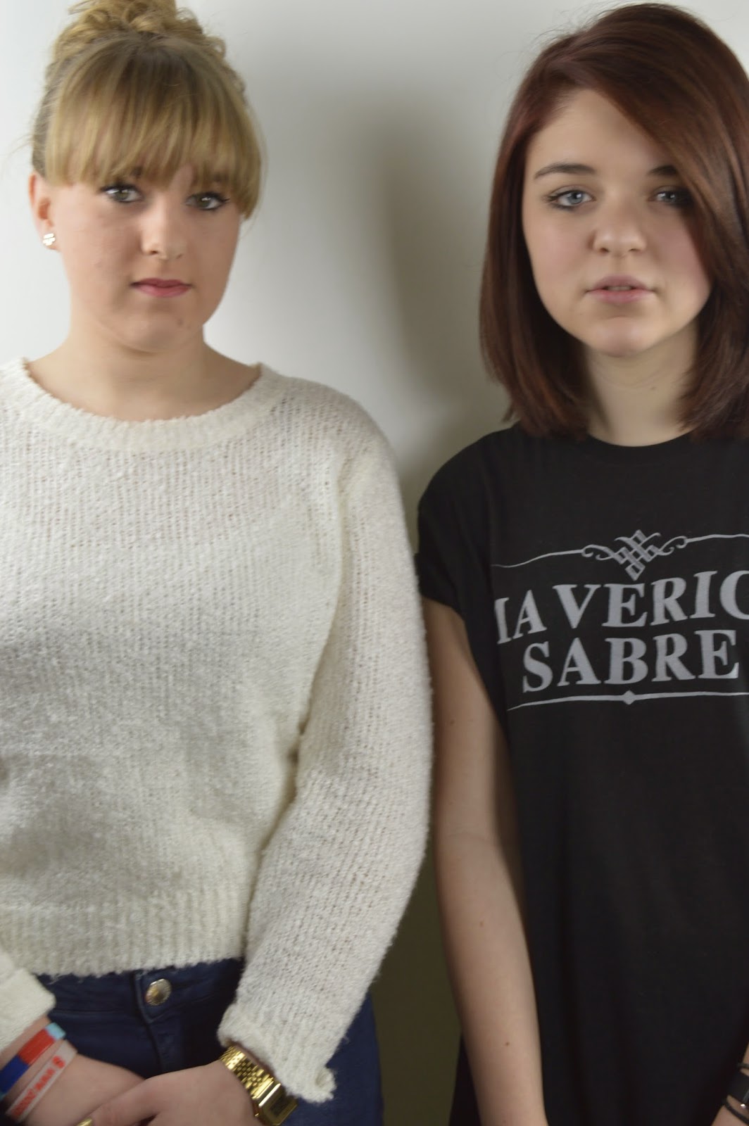
These are the pictures that I have taken in order to use some for my draft magazine. I will not be using all of these shots as I understand some are of bad quality but I wanted to present all of the shots I took in order to get the ones I have used.


 These are the pictures I wish to use in my magazine:

Magazine Plans
Front Page:

Double Page Spread:


Contents Page:

Results From My Survey
I created a survey in which I asked questions which I wanted feedback about regarding my magazine. I then received some anonymous feedback which I have explained below.

1.
At first I asked if the person was male of female. This is because my magazine is targeted at both genders so I wanted to make sure I had feedback from both genders. Evidently, more females took my survey, however, I was still able to show results from both genders.

2.

I then asked their views on the colour scheme that I has chosen to which I gained mixed views. Most people said that they liked the colour scheme and it would work well with my magazine. Some people said that they thought it would stand out,however, some people also thought that it would not stand out and not work well in my magazine. I respect this criticism, however, the majority of the people who took my survey liked my colour scheme meaning that I will stick with this colour scheme.

3.

My third question was then asking people what they thought of 'Daydream' as a name for my magazine, which is the name that I have chosen.  All of the people who took my survey liked this name and thought it linked in well with the indie vibe I wish to create. This has made me gain confidence in my name as I now know that other people like the name and think it it works well.


4.
For my forth question, I asked how often they would purchase my magazine. This is to help me know how often I should sell my magazine, which would also help with the working out of price. I was initially thinking of selling the magazine monthly as it is enough time to prepare a good magazine but is also regular meaning that people will still want to purchase the magazine. This also means that people will not have to spend too much money of the magazine. I think the reason behind people choosing 'never' was purely down to them not buying music magazines or them not being into indie music, which is understandable. The person who selected 'other' wrote:
which is a good reason why people purchase magazines and what attracts people to a magazine a lot of the time. This has made me think that I can not always have unknown artists on the front cover as it may result in people not purchasing my magazine.

5.

For my fifth and final question I then asked which artists people listened to. This was to enable me to get a better understanding of who I should include inside of the magazine or name on the front cover. This is so that people are attracted to my magazine and want to purchase and read my magazine because a musician they like is included in the magazine.

Monday, 26 January 2015

My Survey 
Please would you take time to answer my survey by clicking the link above, thank you.

Friday, 23 January 2015

Magazine Construction Task
Deadline
Below is the steps I used to construct a magazine.
I began with a white, A4 background.
I added the title 'Deadline' to the top of the page in the font 'Engravers MT'. This is font size 100. 
 I then added an image of the musician I wanted to be displayed, which is James Bay. I used the quick selection tool to cut around the artist and delete the background of the image.
I then added the barcode. I resized this and placed it in the bottom left hand corner of the magazine. 
 I then added the month, issue number and price. All of this information is in the same font as the title. The date and issue are font size 24 whilst the price is font size 18.
I then added the name of the artist, James Bay, in the same font, size 50 and placed it where I thought would be appropriate.

I changed the positioning of the barcode and rotated it.
This is my final magazine.


Tuesday, 20 January 2015

Class Feedback
From my pitch - http://qmlcmedia15.blogspot.co.uk/2015/01/25-word-pitch-my-music-is-indie.html I was asked these questions to which I gave the response which is given under the question.

Is your magazine only including up and coming artists?
I chose to target the magazine at up and coming artists as these are the musicians which my target audience like to listen to. This means that the magazine will attract them more rather than big and well known artists.

Why are you aiming your magazine at this age bracket?
I chose to target my magazine at this age bracket as this is the age range that are most likely to buy and enjoy my magazine. Therefore, by targeting the magazine at them it will encourage them more to purchase the magazine.

From which magazines will you be taking inspiration from?
The types of magazine which I will be taking inspiration from are Dazed & Confused and Clash. Dazed & Confused are simplistic and I like the way in which their information is arranged on the page. I chose Clash because I find the magazine front covers interesting and eye-catching. 

Monday, 19 January 2015

Self-Reflection
Update
3x Analysis of Front Covers, Contents Pages and Double Page Spreadshttp://qmlcmedia15.blogspot.co.uk/2015/01/analysis-of-three-font-covers-contents.html

I feel as though I have learnt a lot more about magazines through the course of completing these tasks. This is because I have been analysing magazines a lot more and how items are set out. Through this I feel as though I have a much better idea of how I would like my magazine to look and what I think would be appealing to my audience.

Organisation and Time Management
I feel as though I have worked with the schedule well so far as I managed to complete all of the work in the set time, proving that I have managed my time well. However, I feel as though I should have started the work a lot earlier than I did because I would not have then felt as rushed as I did in the last few days. I may have been able to produce the work to a better standard but I feel as though I have put a lot of effort into the work so far.

Research and Planning
I feel as though I have learnt a lot more about music magazines. I have found that there are a variety of music magazines that all lay out their content in different ways. Some magazines chose to keep their pages simple yet effective where as some magazines prefer to put a lot of items into their magazines to may it look busy. I have also found out that some magazines prefer to use quite subtle colours where as other use bright and eye-catching colours.
I feel as though which ever way I choose to set out my magazine, I will do it to the best of my ability and hopefully make it look as though it is a real music magazine that could be bought in a shop. This would show that I would be able to take on ideas and replicate them well, showing skill. Factors that I feel I would be able to replicate are things such as the colour scheme and the layout. A colour scheme would be easy to replicate and would not take a lot of effort. The layout of the magazine would take a little longer but I feel as though I would be able to place the right items in the correct place when creating the magazine. 
I feel as though if I chose to replicate a magazine such as Clash, it may become misunderstood and may look as though I was not be able to lay out the content appropriately. This is because there are pieces of text which have been put in places which typically you would not have thought about putting. For example, on one of the Clash magazines there is no text about a little bit of text over the models face. 

Technology
I feel as though I should be able to take the pictures well as I enjoy photography. If I manage to take a good photograph for the front cover of my magazine, this will add to the professionalism of the magazine and make it look better than if I were to use a photograph that was, for example, blurry. 
However, I do not feel as though I am good at working with Photoshop, which is the programme which we will be using to create the magazine. The first time I used this programme was to create the preliminary magazine. I feel as though I learnt the basics of the software when using it to create the preliminary but it did take me a while to come to terms with and be able to do everything which I wanted to do. I feel as though I may need to take a little bit of time to practise with the software before I begin to create the magazine to ensure that I am able to create the magazine to the best of my ability.

Friday, 16 January 2015

25 Word Pitch
My music magazine is an Indie magazine named Daydream. My audience is 15-24 year old indie scenesters who enjoy listening to up and coming artists, both male and female. This is a growing market, which is currently at popular demand, and this is the reason why I have chosen to make my magazine around this market. The style of my magazine will be the reason why it appeals to this audience. This is because I will make sure the front cover will appeal and be attractive to this market. The price will be £2.99 meaning that it will be in the price range for my target audience. The colour scheme will be Black, White and Pastel Green. This is because the green will be the colour that stands out among others.

25 Words:
Indie
Daydream
15-23
Indie Scenesters
Up and coming artists
Male
Female
Growing Market
Popular Demand
Style
Front Cover
Attractive
£2.99
Black
White
Pastel Green
Stands Out

Thursday, 15 January 2015

Analysis of Institution
Below is an analysis of an institution that I would feel I would like to publish my magazine.

Research Graphic Designers
Arem Deplessis

Arem Deplessis is a graphic designer who works for The New York Times Magazine. His style is interesting and different and is the reason why he is so popular. He creates magazines in a way that is imaginative and give character to the magazine. I feel as though if I am able to add imagination to my magazine and not make it like the 'typical' magazine then it will stand out and people may be more encouraged to purchase it.

Wednesday, 14 January 2015

Research Relavent Photographers

Mert & Marcus

I chose to look at Mert & Marcus’s photography because as soon as I found their pictures, I initially saw the variety of colours and the variation between the pictures. This interested me and attracted me towards the images which they produce. I found that their pictures where different, they looked effortless yet a lot of time would have been spent on taking that perfect picture. I feel as though their style of images would look good on the front of a magazine as it would automatically grab attention and attract people to the magazine. I think that if I were to take an image like one of the below and put it on the front cover of my magazine, it would grab attention and automatic interest to my magazine. The images strike curiosity and wonder into how the images were thought of. For example, the image on the top right makes you wonder what this image was taken for and makes you think of the deeper meaning behind the image.


Research Relevant Photographers 

Jan Welters

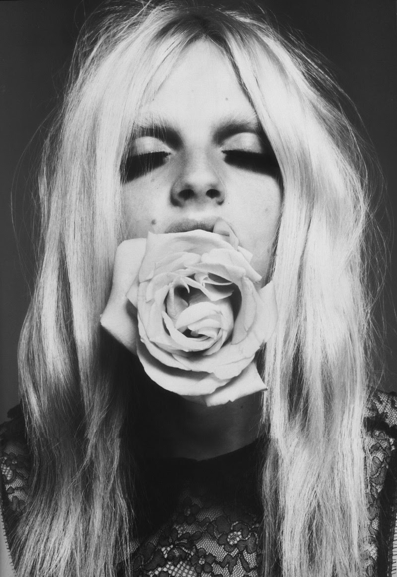
Jan Welters takes simple yet effective images creating a lot of interest to her work. She also takes a lot of monochrome images but does often chose to take photos in colour, showing that she has different types of photos. I chose to look at her work as I found the pictures that I first saw interesting and different. If I used interesting images on the front of my magazine, I would draw attention. For example, the image displayed on the bottom right automatically drew my eye as the length in which the model's bottom eye lashes were made were unusual and automatically makes the image interesting. I feel as though I should take away from this photographer the model looking into the camera lens  This adds depth the picture and may create a connection with the audience to my magazine's front cover.